Inference conclusion
Lecture 22
2025-04-14
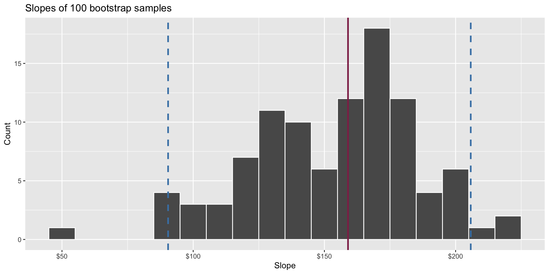
The bootstrap
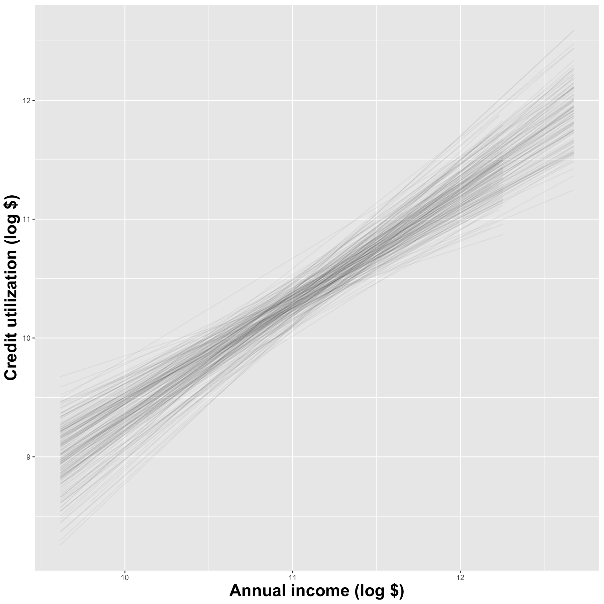
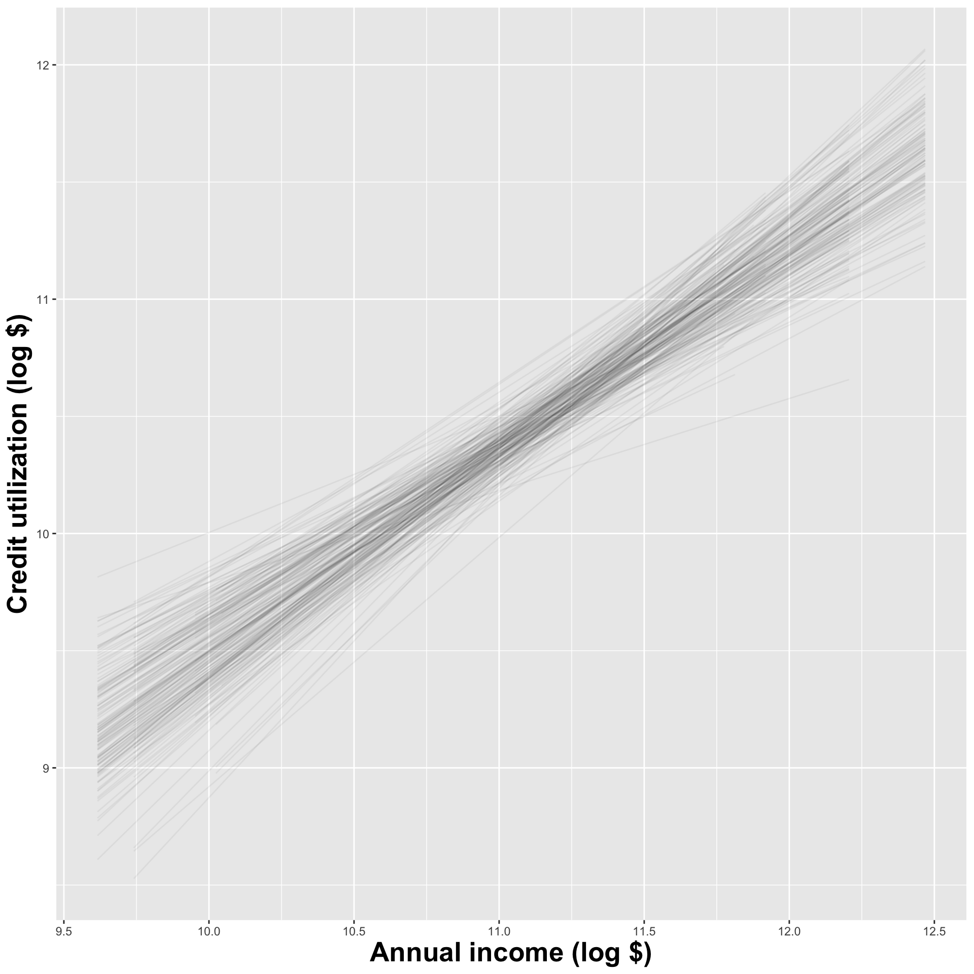
Construct different, alternative datasets by sampling with replacement from your original data. Each bootstrap sample gives you a different estimate, and you can see how vigorously they wiggle around:
Interval estimation
Use the bootstrap distribution to construct a range of likely values for the unknown parameter:
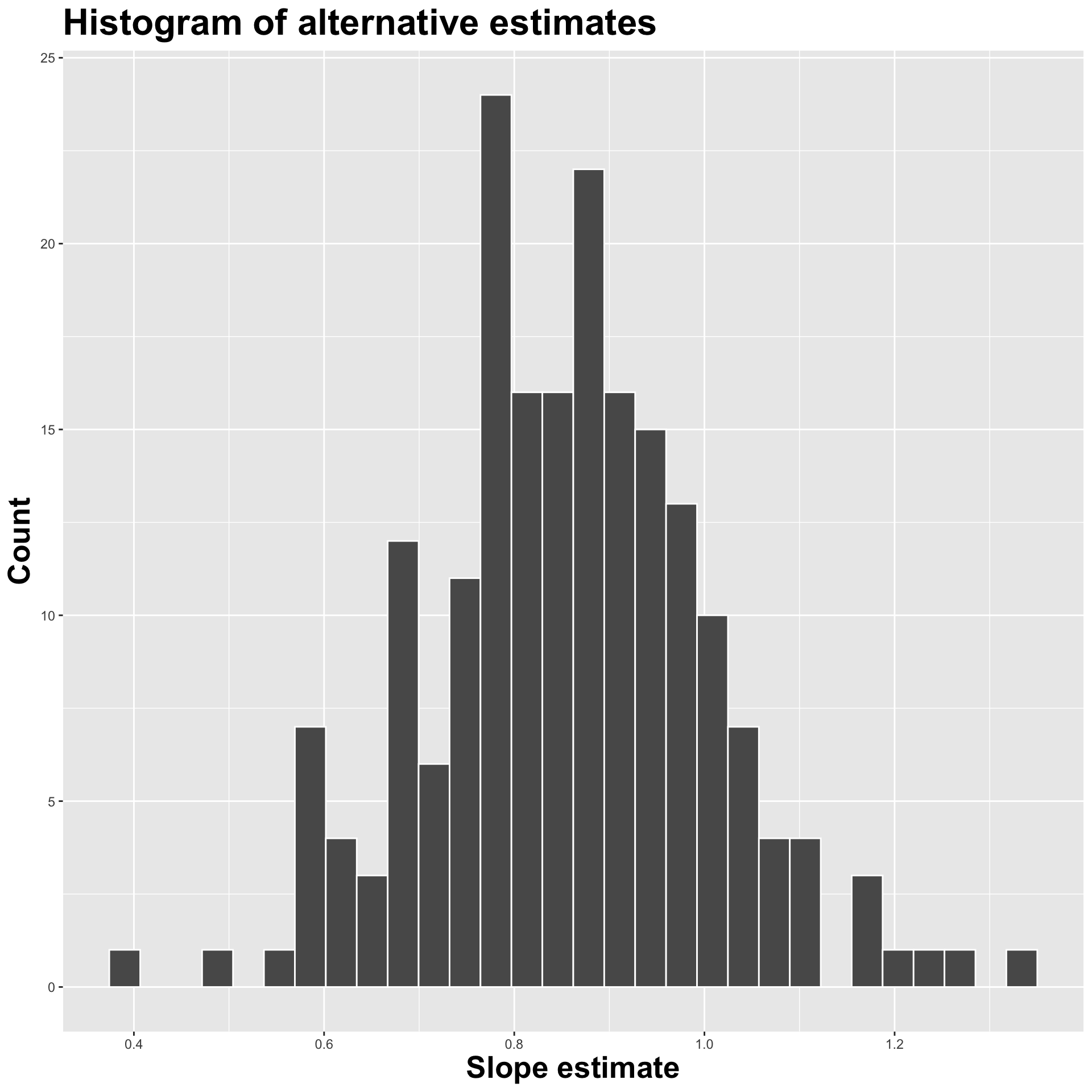
We use quantiles (think IQR), but there are other ways.
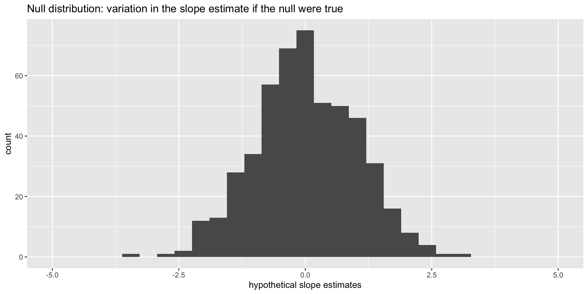
Null distribution
If the null happened to be true, how would we expect our results to vary across datasets? We can use simulation to answer this:
This is how the world should look if the null is true.
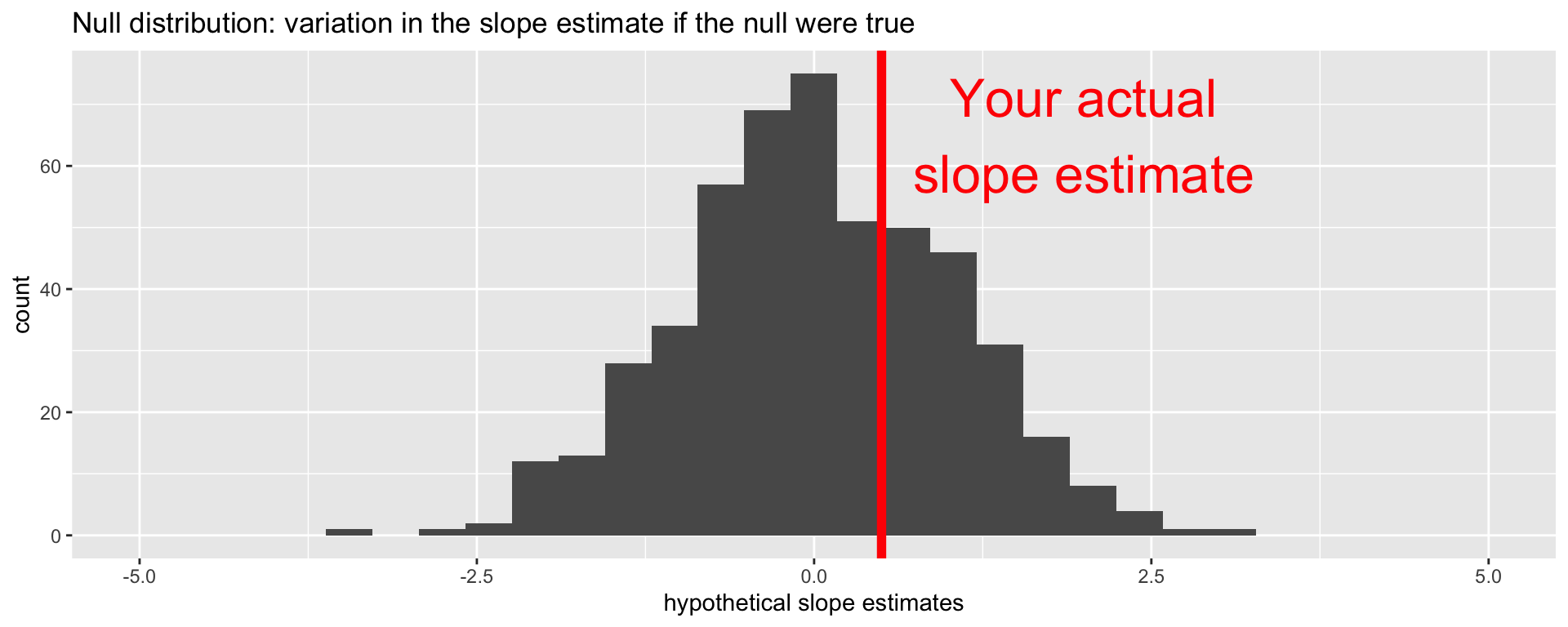
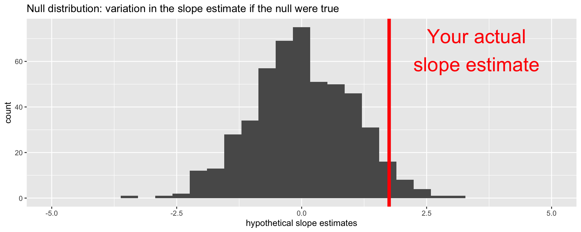
Null distribution versus reality
Locate the actual results of your actual data analysis under the null distribution. Are they in the middle? Are they in the tails?
Are these results in harmony or conflict with the null?
Null distribution versus reality
Locate the actual results of your actual data analysis under the null distribution. Are they in the middle? Are they in the tails?
Are these results in harmony or conflict with the null?
Null distribution versus reality
Locate the actual results of your actual data analysis under the null distribution. Are they in the middle? Are they in the tails?
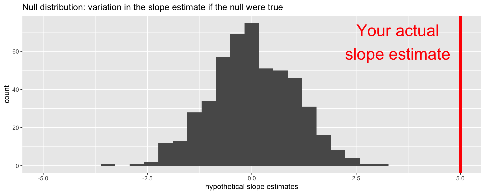
Are these results in harmony or conflict with the null?
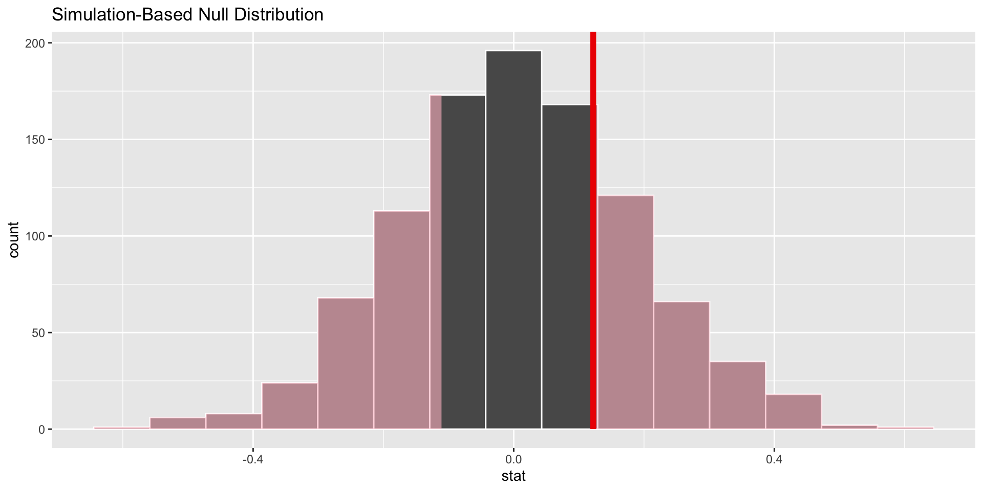
p-value
p-value is the fraction of the histogram area shaded red:
Big ol’ p-value. Null looks plausible
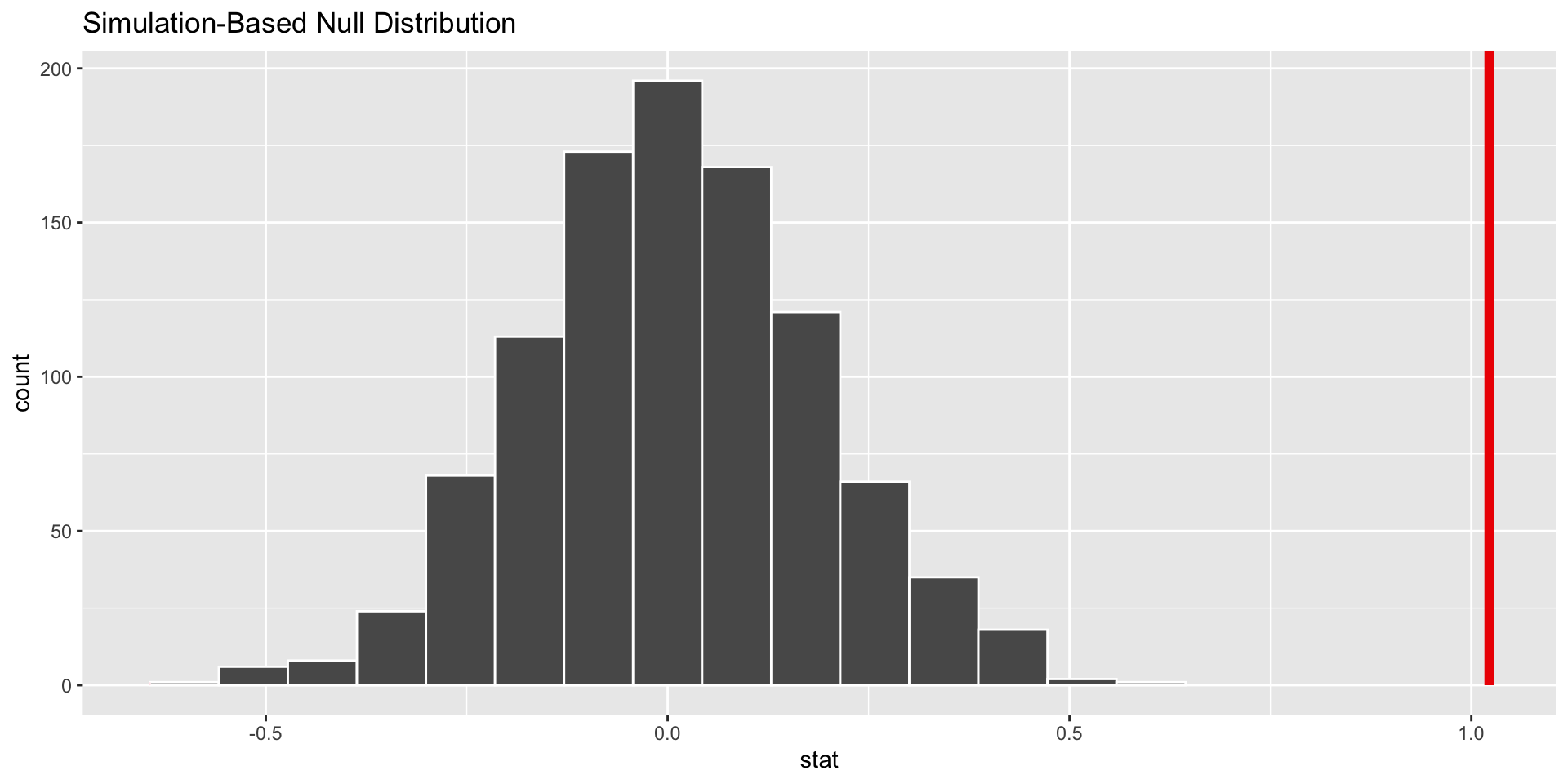
p-value
p-value is the fraction of the histogram area shaded red:
p-value is basically zero. Null looks bogus.
p-value
p-value is the fraction of the histogram area shaded red:
p-value is…kinda small? Null looks…?
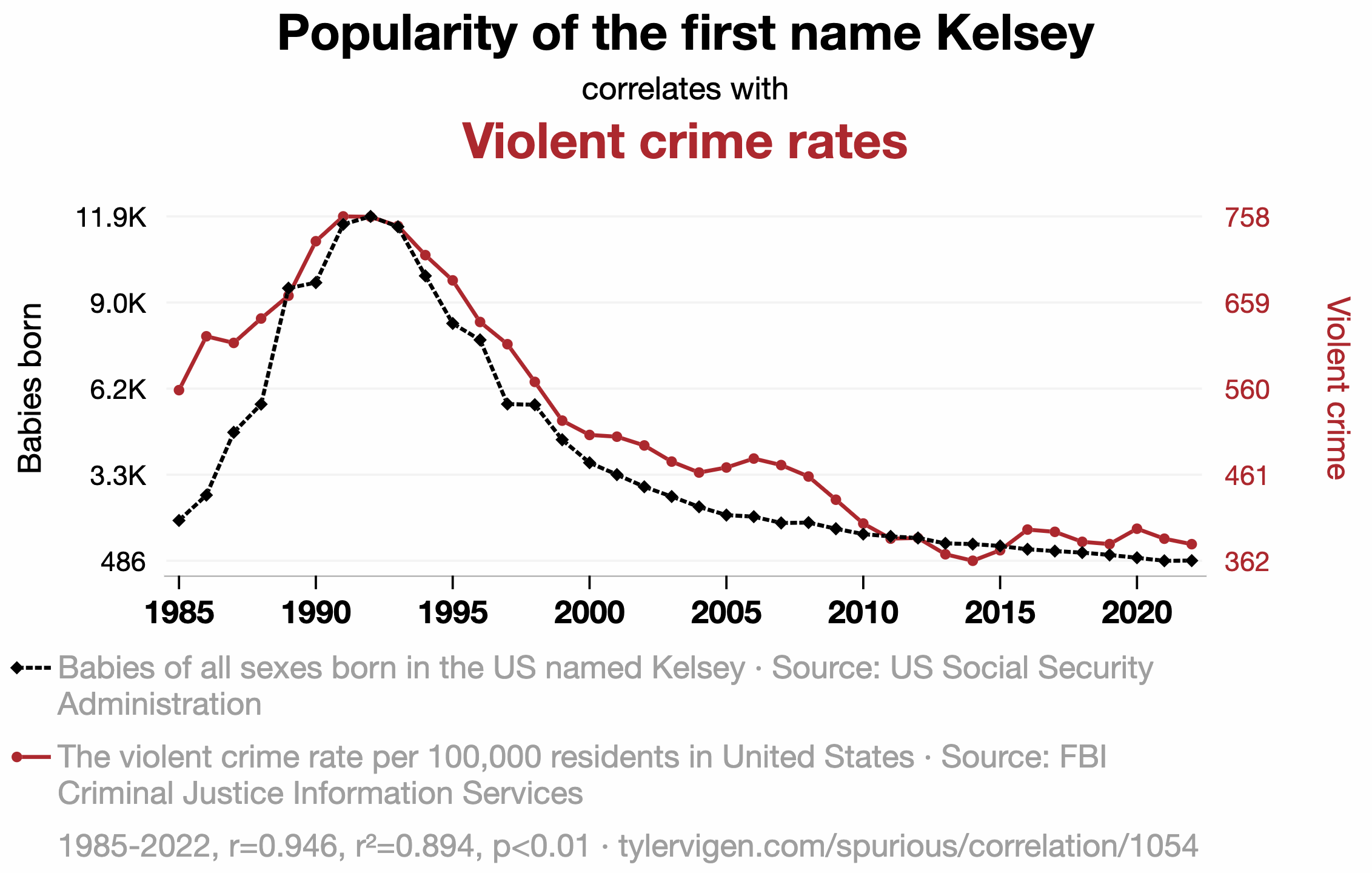
Plenty of nonsense correlations out there
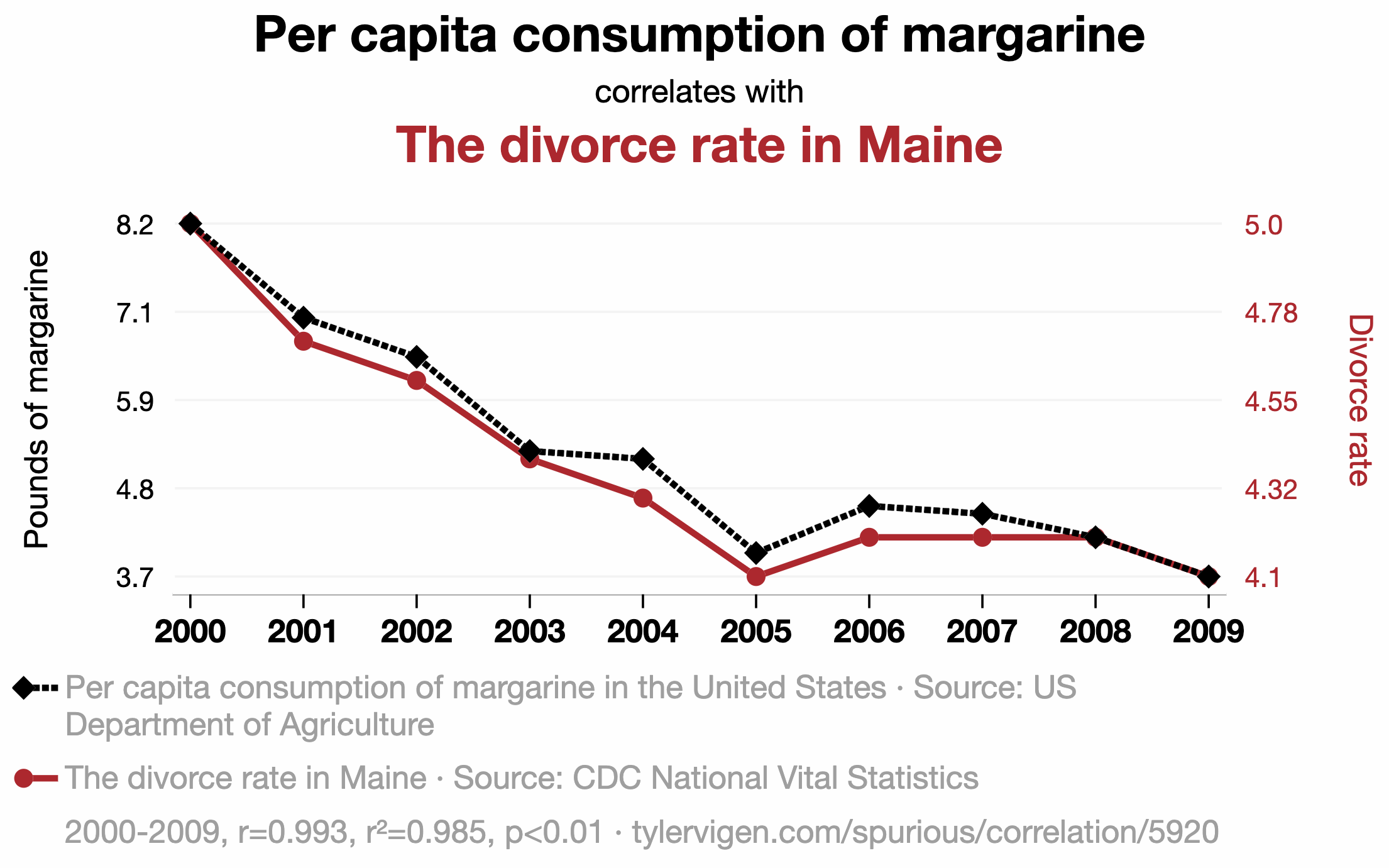
Plenty of nonsense correlations out there
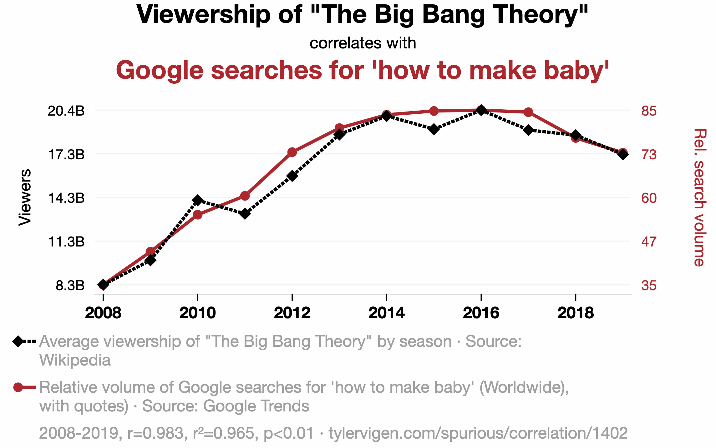
Plenty of nonsense correlations out there
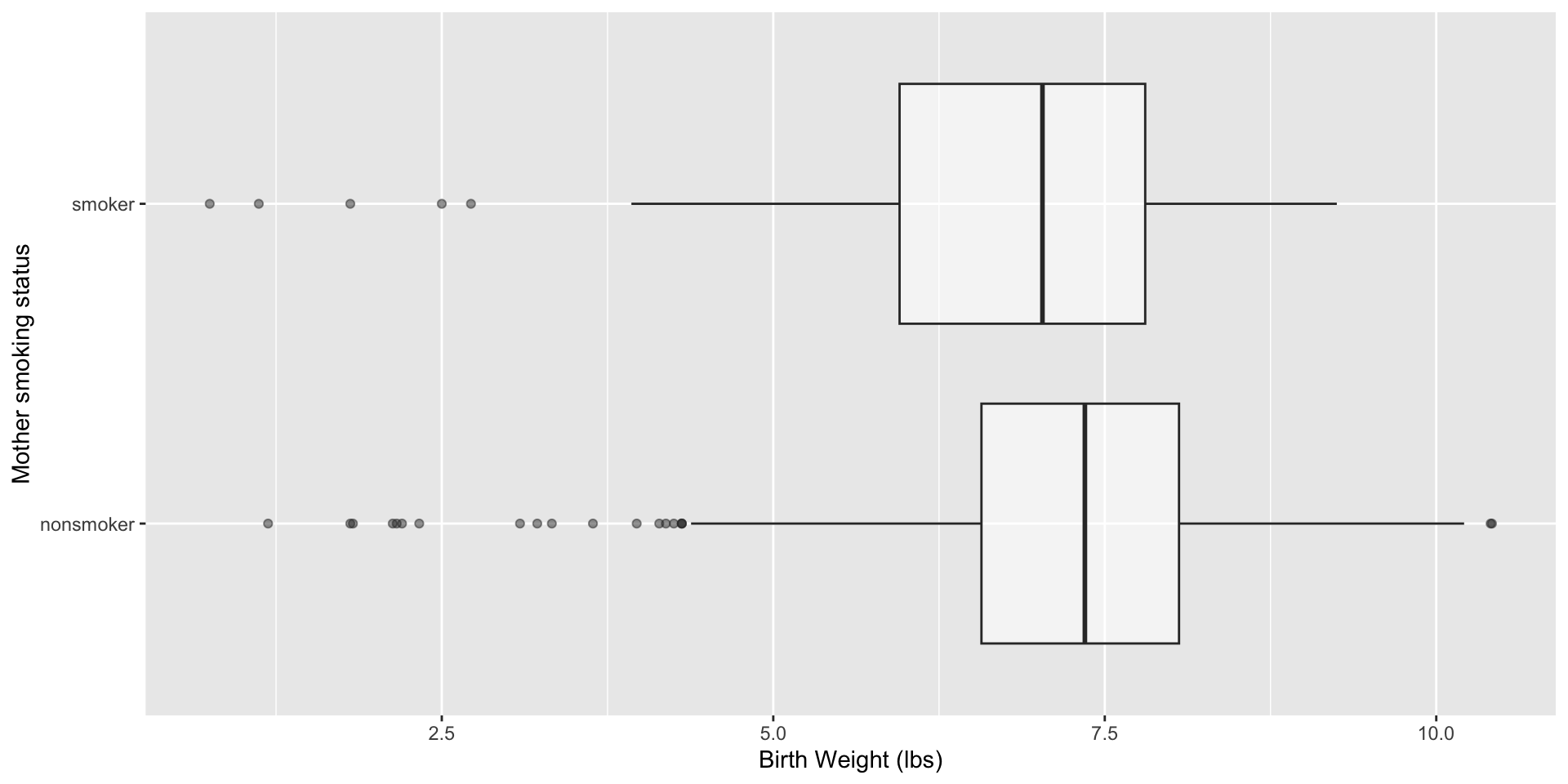
ABV
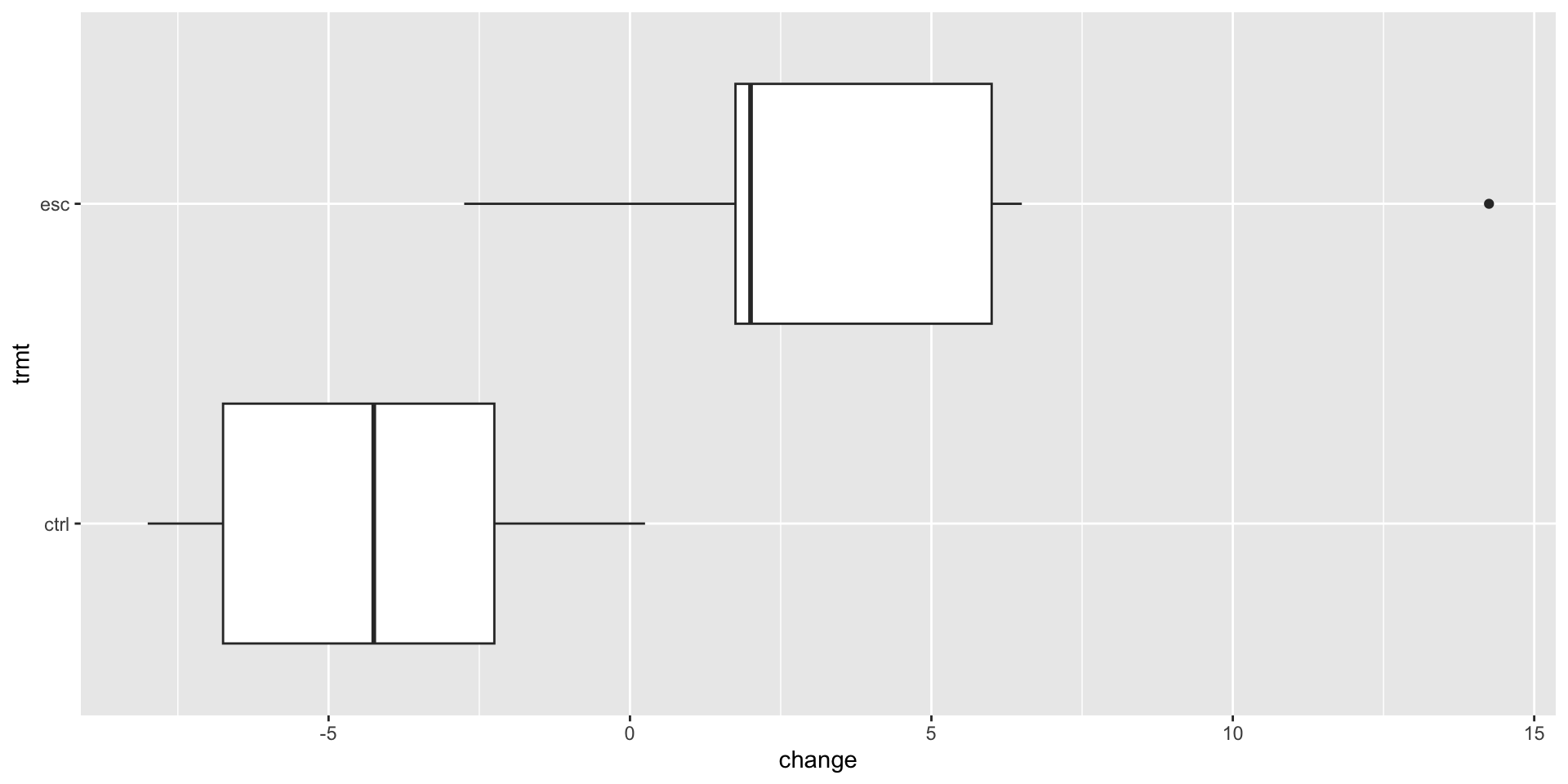
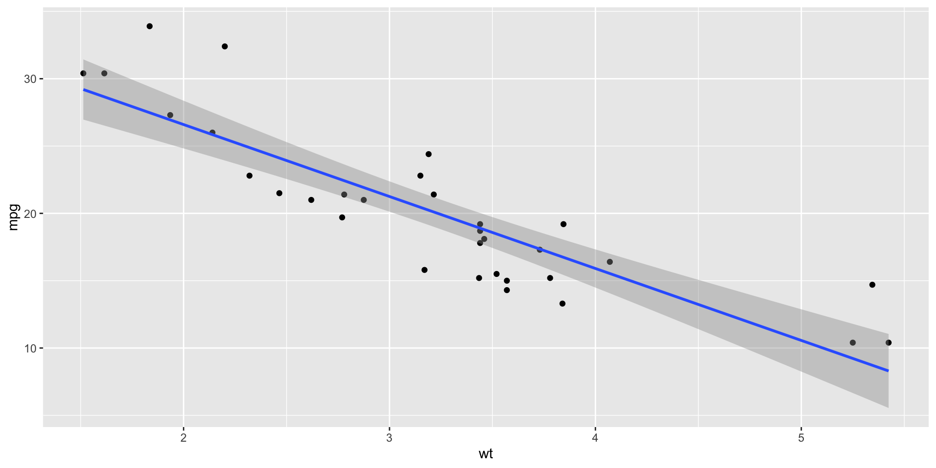
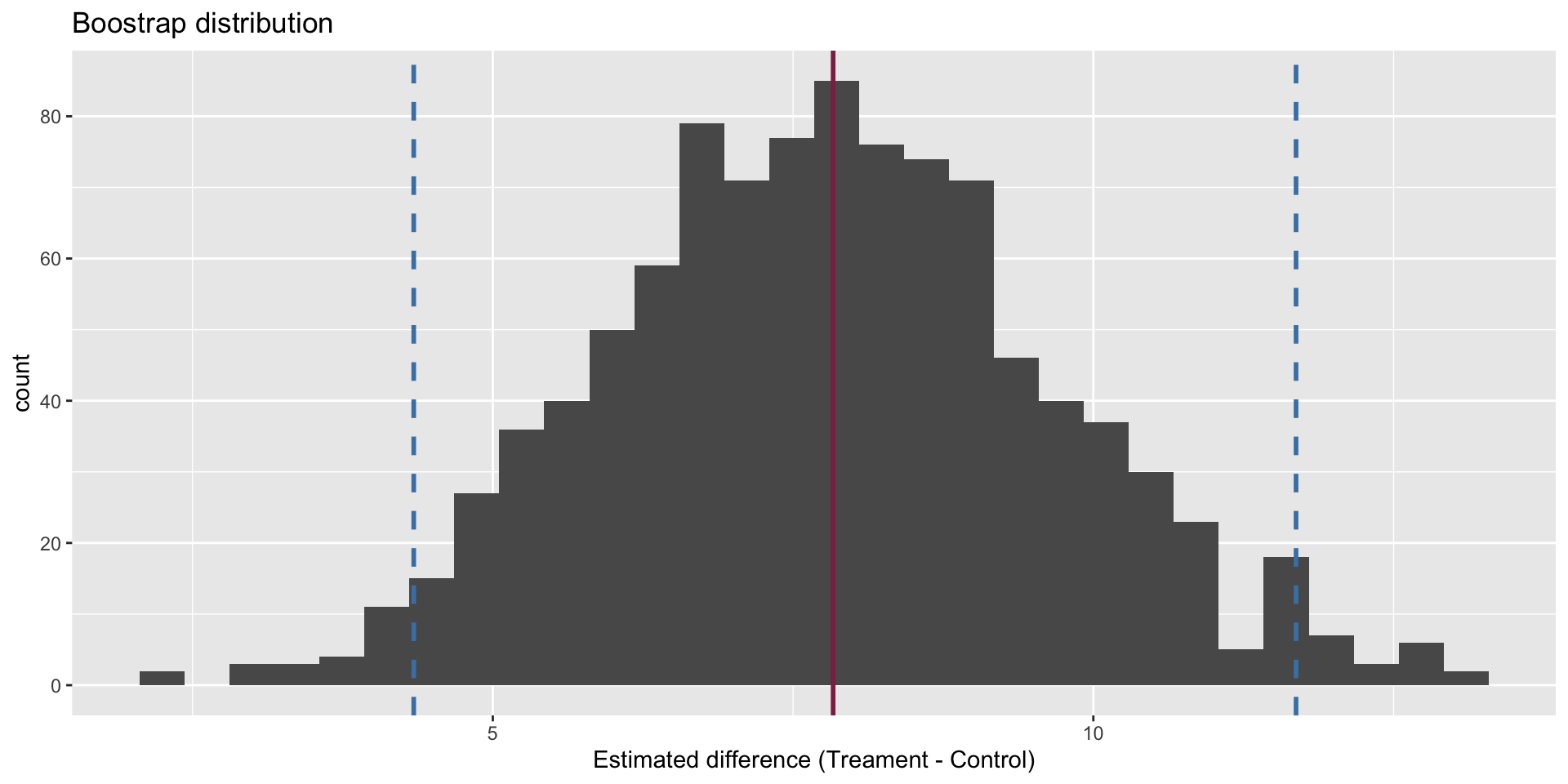
Confidence interval
We are 95% confident that the true mean difference is between 4.34 and 11.7.
Hypothesis test
The p-value is basically zero.
Visualize
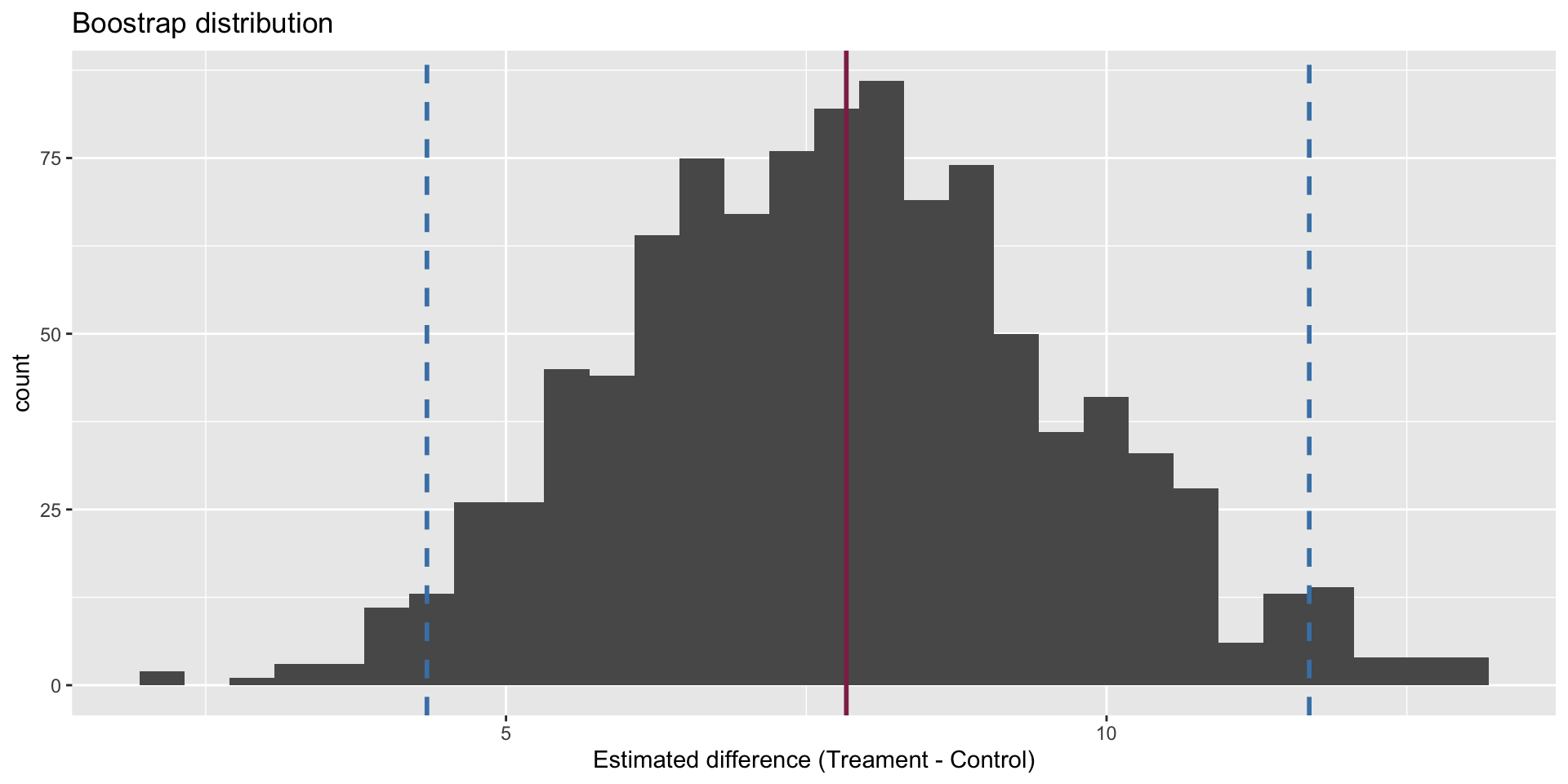
Confidence interval
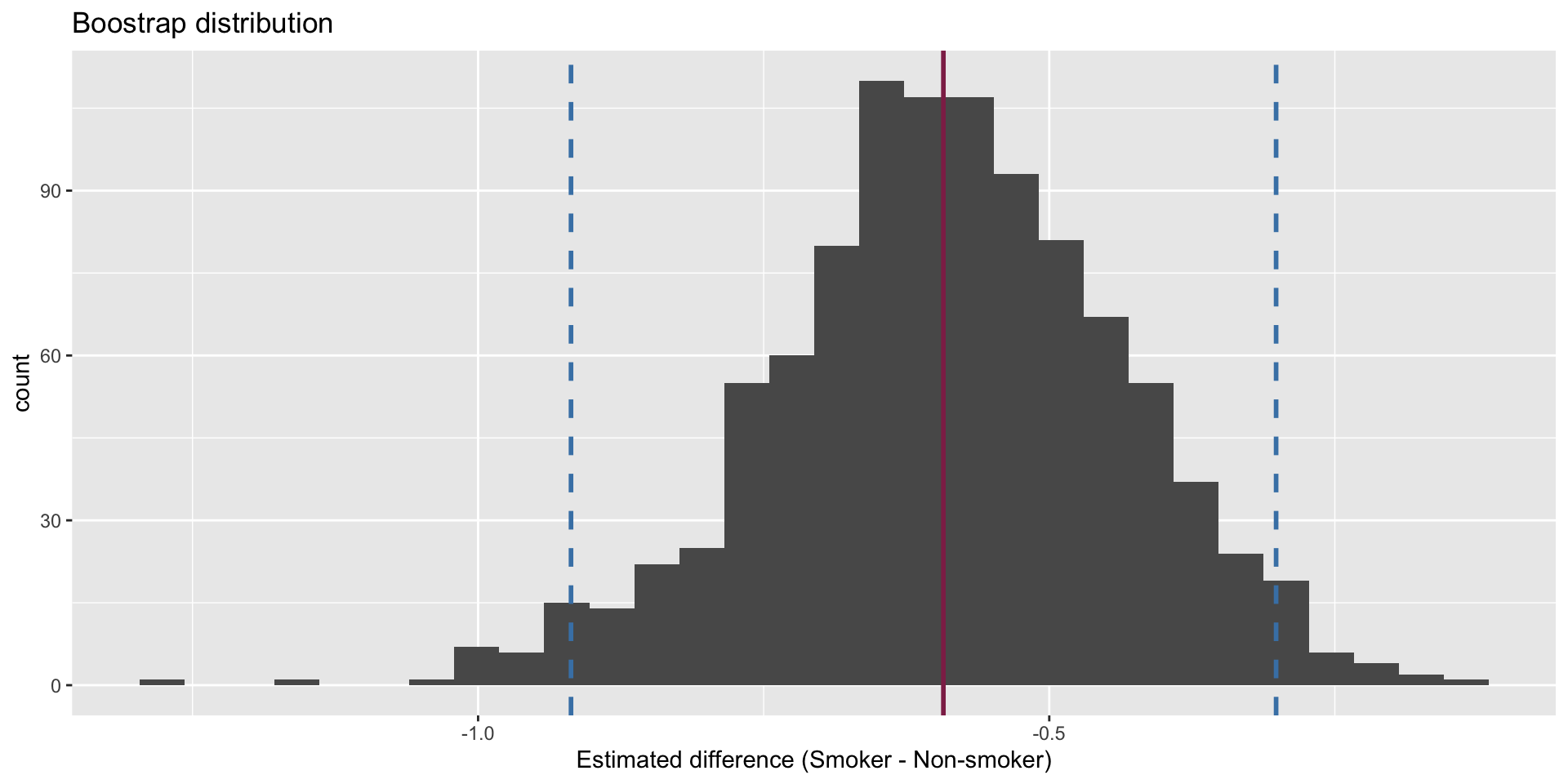
Hypothesis test
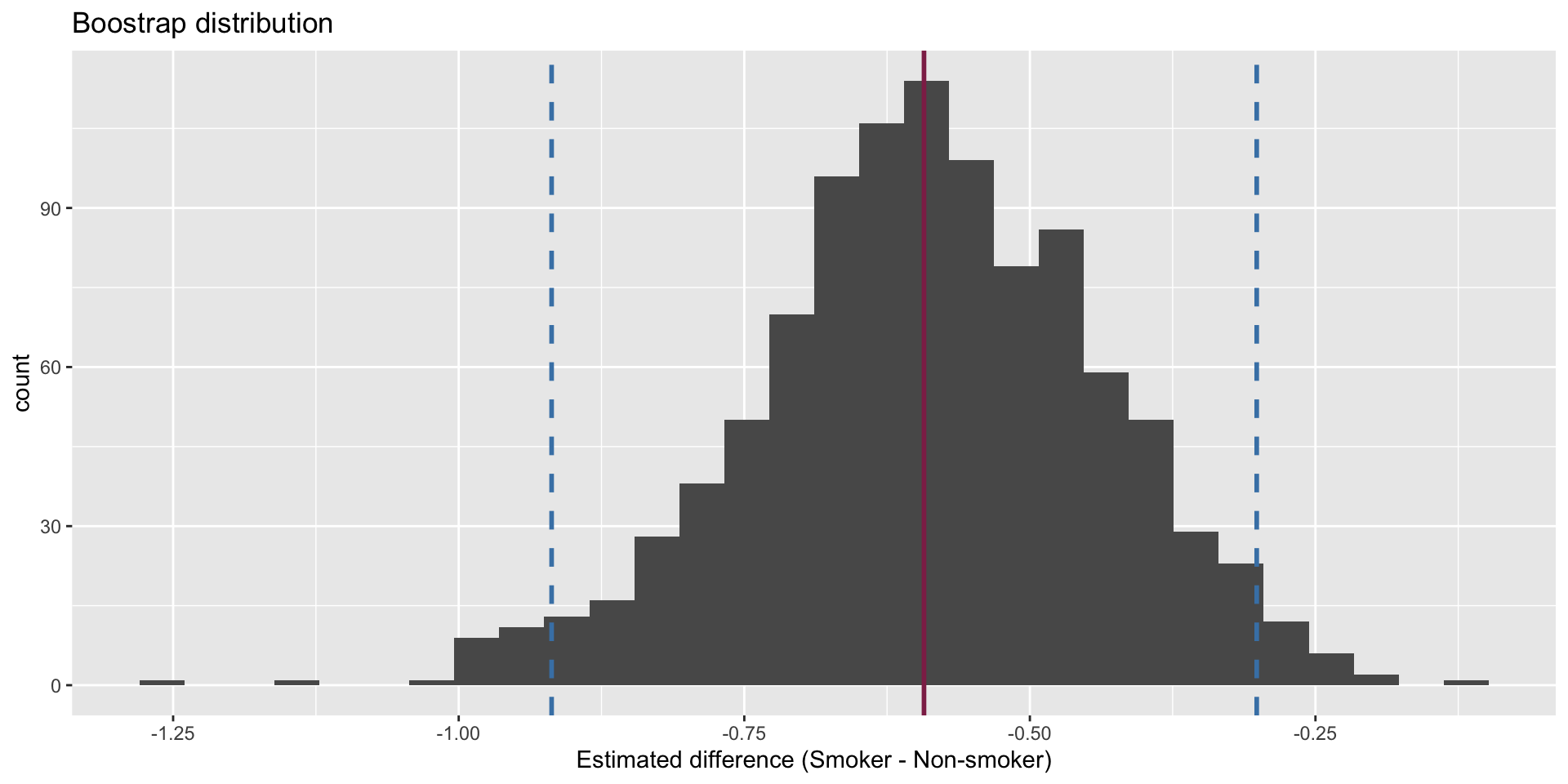
The p-value is basically zero.
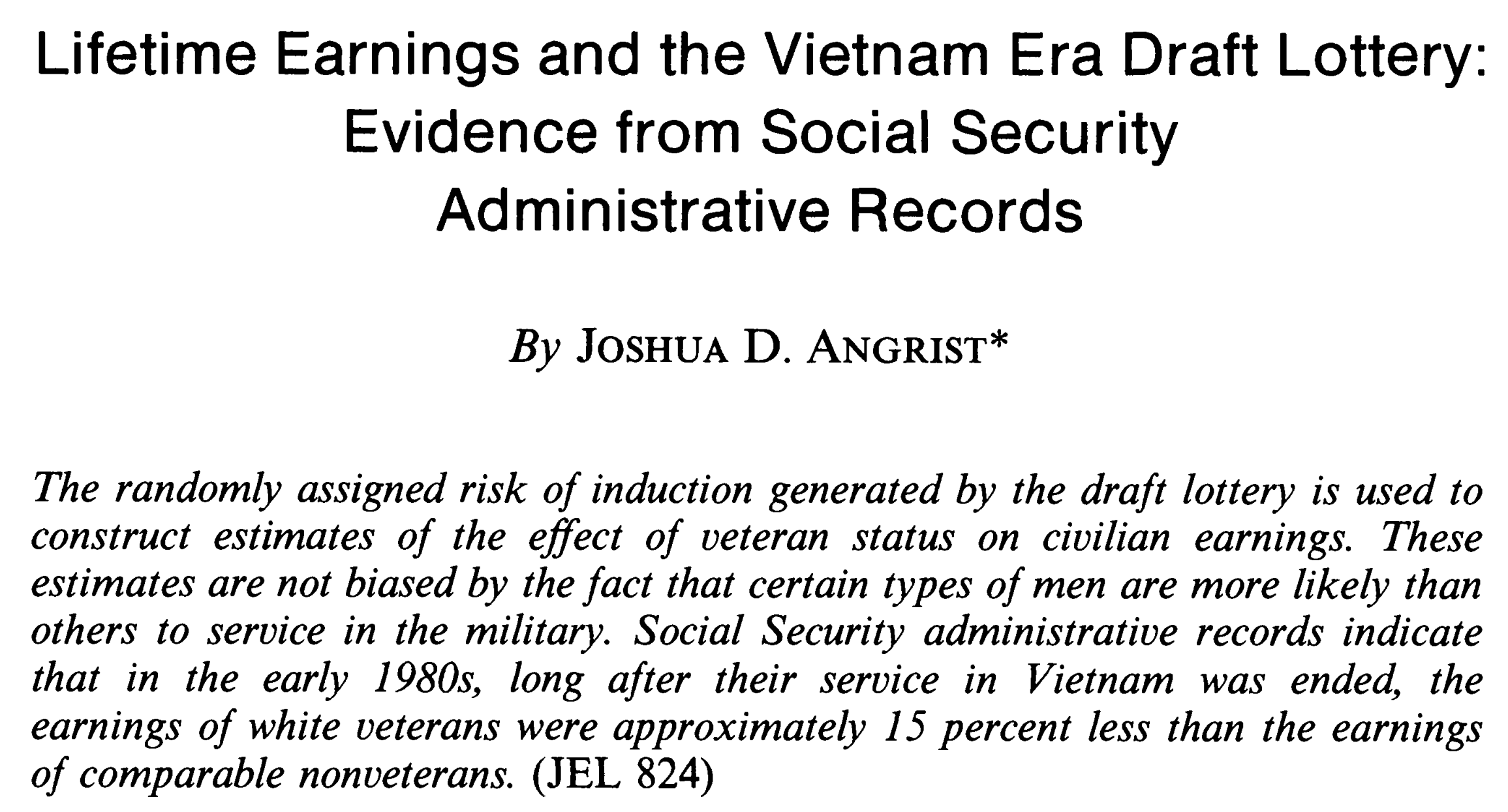
Nobel prize winning research
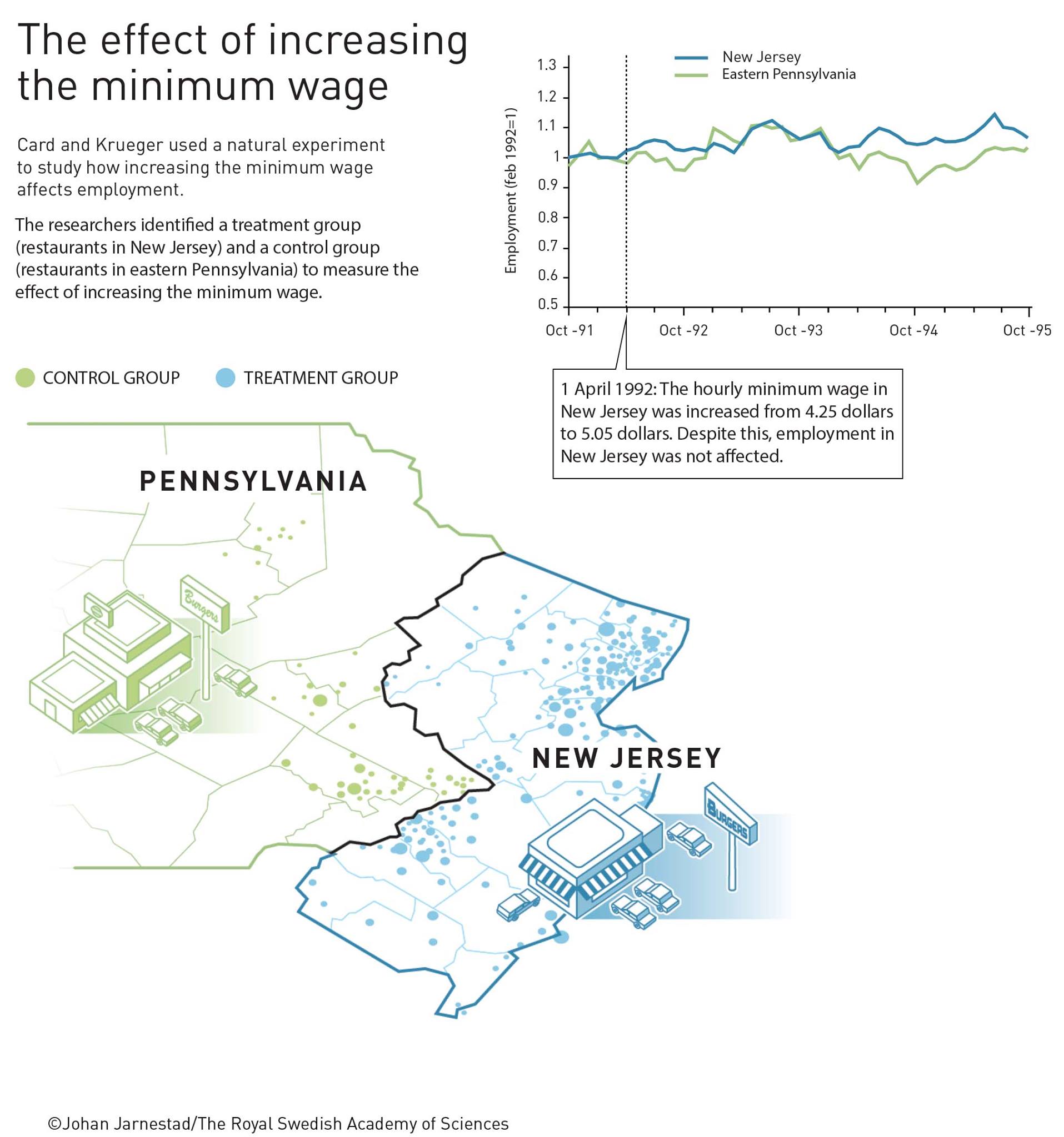
Another natural experiment: Card and Krueger
The ECON 101 story
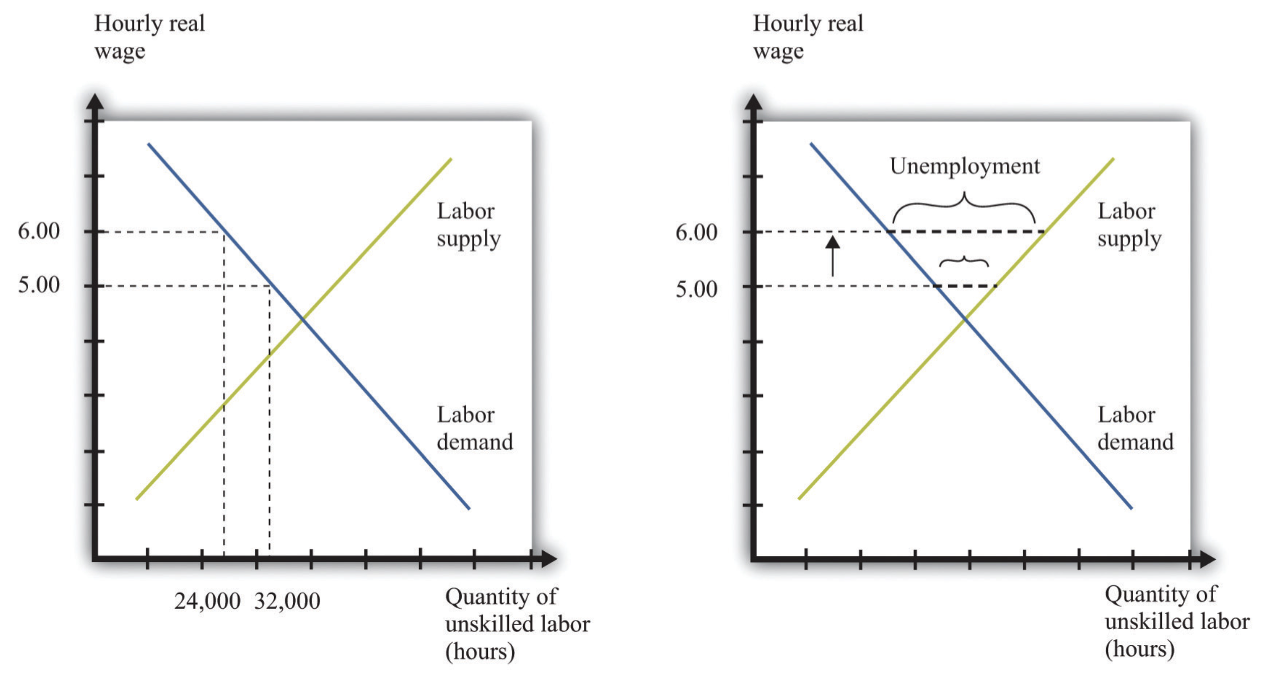 This is a claim (hypothesis!) about how the data will look. Let’s see!