# A tibble: 5 × 2
      x `2011`
  <dbl>  <dbl>
1  -2     -2
2  -0.5   -0.5
3   0.5    0.5
4   1      1
5 2 2 More practice
Lecture 10
2025-02-13
Code smell
One way to look at smells is with respect to principles and quality: “Smells are certain structures in the code that indicate violation of fundamental design principles and negatively impact design quality”. Code smells are usually not bugs; they are not technically incorrect and do not prevent the program from functioning. Instead, they indicate weaknesses in design that may slow down development or increase the risk of bugs or failures in the future.


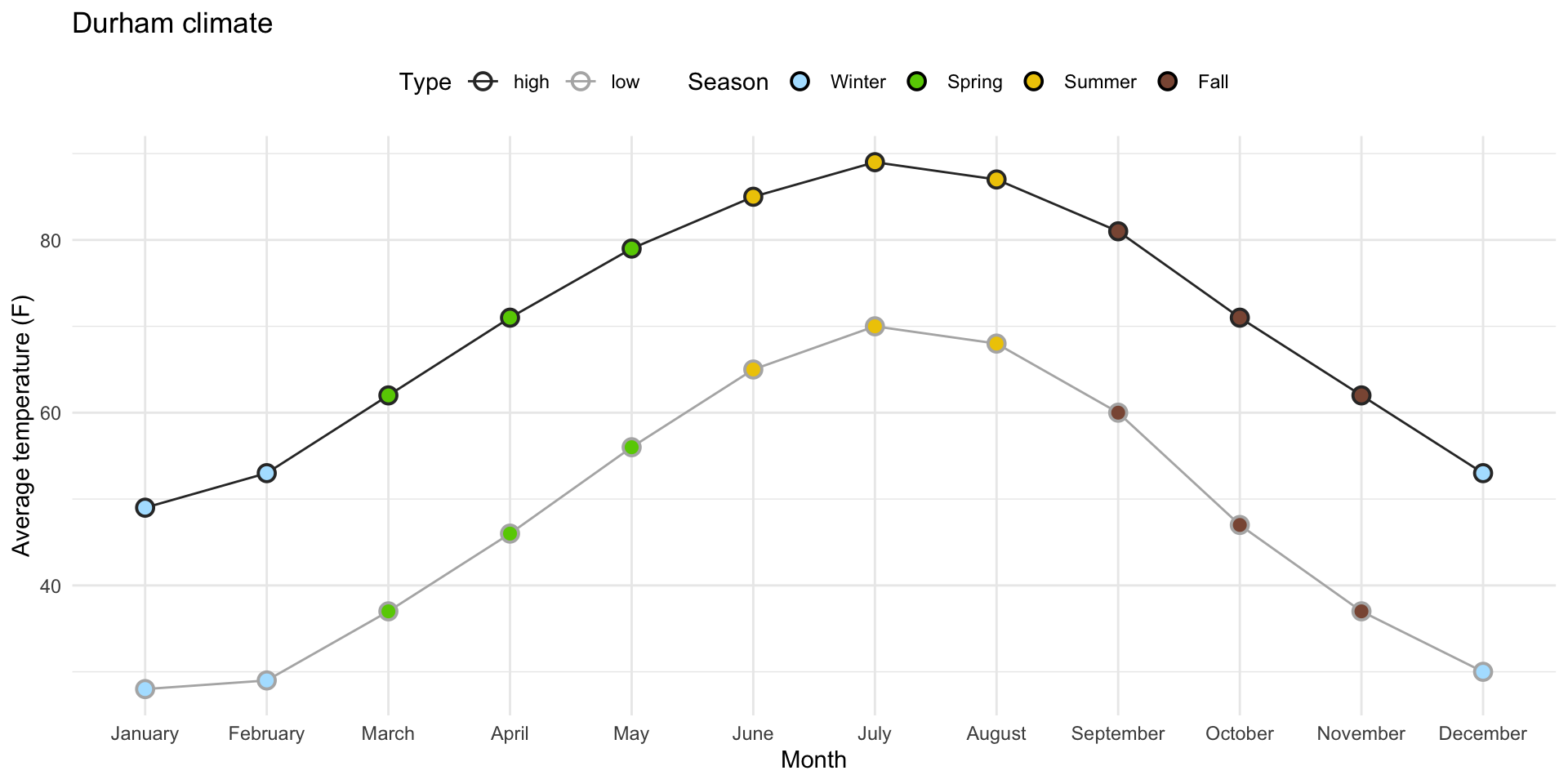
Task 1: Prettifying the plot from ae-07

0. Why group = 1?
With it:

0. Why group = 1?
Without it (even though I have geom_line!):
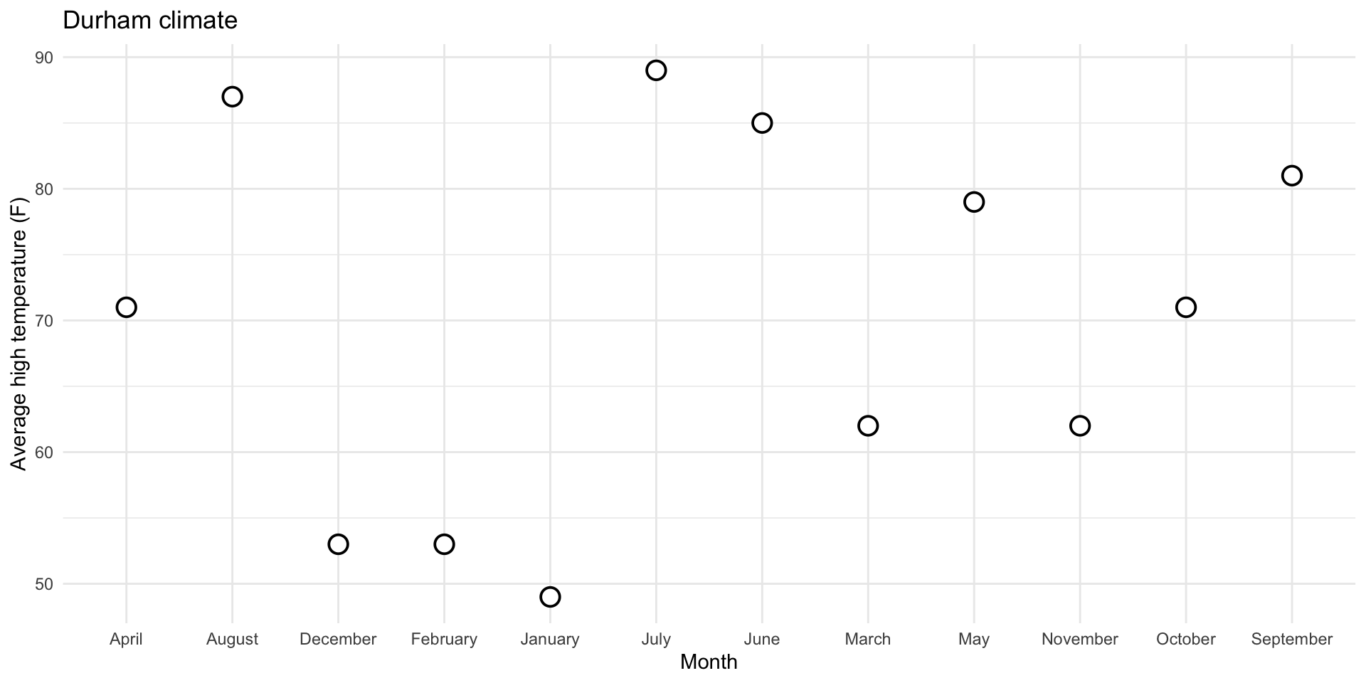
0. Why group = 1?
Don’t need group for numerical vs numerical:
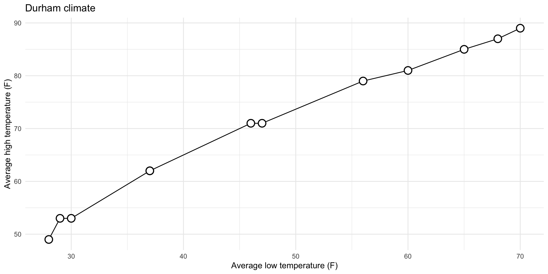
0. Why group = 1?
Do need group for categorical vs numerical:
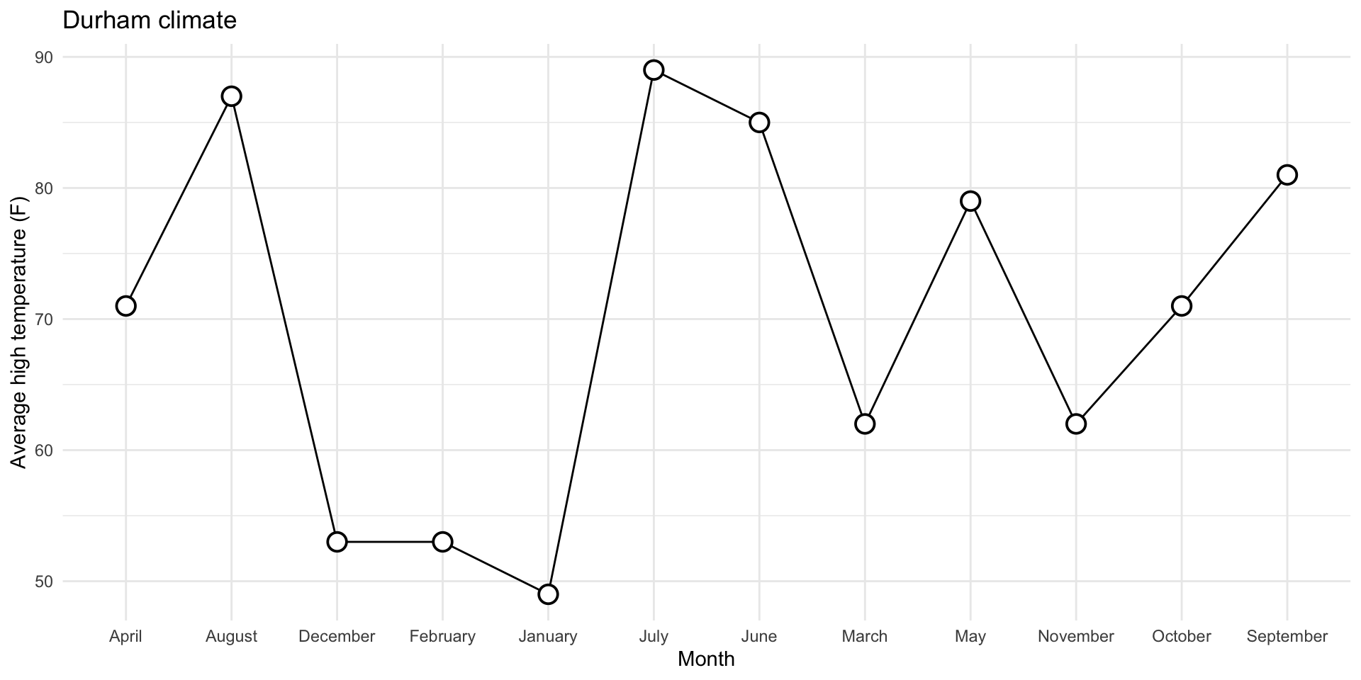
1. Reorder the months chronologically
durham_climate |>
  mutate(
    month = fct_relevel(month, month.name)
  ) |>
  ggplot(
    aes(x = month, y = avg_high_f, group = 1)
  ) +
  geom_line() +
  geom_point(
    shape = "circle filled", size = 4,
    color = "black", fill = "white", stroke = 1
  ) +
  labs(
    x = "Month",
    y = "Average high temperature (F)",
    title = "Durham climate"
  ) +
  theme_minimal()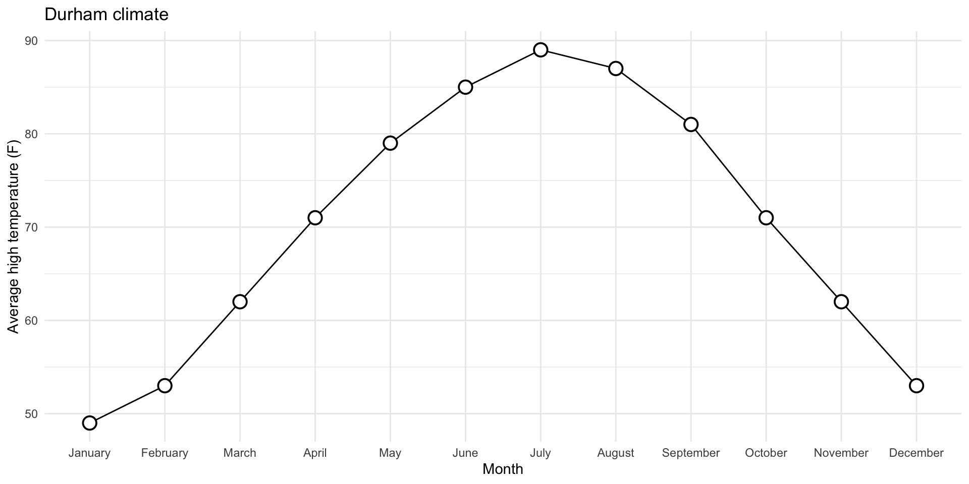
2. Fill the circles with season-specific colors
durham_climate |>
  mutate(
    month = fct_relevel(month, month.name),
    season = case_when(
      month %in% c("December", "January", "February") ~ "Winter",
      month %in% c("March", "April", "May") ~ "Spring",
      month %in% c("June", "July", "August") ~ "Summer",
      month %in% c("September", "October", "November") ~ "Fall",
    )
  ) |>
  ggplot(
    aes(x = month, y = avg_high_f, group = 1)
    ) +
  geom_line() +
  geom_point(
    aes(fill = season),
    shape = "circle filled", size = 4,
    color = "black", stroke = 1
  ) +
  scale_fill_manual(
    values = c(
      "Winter" = "lightskyblue1",
      "Spring" = "chartreuse3",
      "Summer" = "gold2",
      "Fall" = "lightsalmon4"
    )
  ) +
  labs(
    x = "Month",
    y = "Average high temperature (F)",
    title = "Durham climate"
  ) +
  theme_minimal()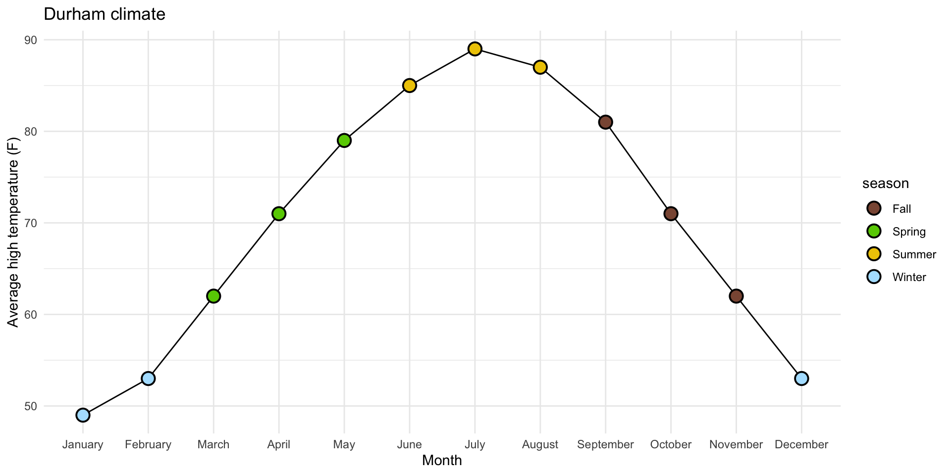
3. Add legend for season to top of plot
durham_climate |>
  mutate(
    month = fct_relevel(month, month.name),
    season = case_when(
      month %in% c("December", "January", "February") ~ "Winter",
      month %in% c("March", "April", "May") ~ "Spring",
      month %in% c("June", "July", "August") ~ "Summer",
      month %in% c("September", "October", "November") ~ "Fall",
    )
  ) |>
  ggplot(
    aes(x = month, y = avg_high_f, group = 1)
    ) +
  geom_line() +
  geom_point(
    aes(fill = season),
    shape = "circle filled", size = 4,
    color = "black", stroke = 1
  ) +
  scale_fill_manual(
    values = c(
      "Winter" = "lightskyblue1",
      "Spring" = "chartreuse3",
      "Summer" = "gold2",
      "Fall" = "lightsalmon4"
    )
  ) +
  labs(
    x = "Month",
    y = "Average high temperature (F)",
    title = "Durham climate"
  ) +
  theme_minimal() +
  theme(legend.position = "top")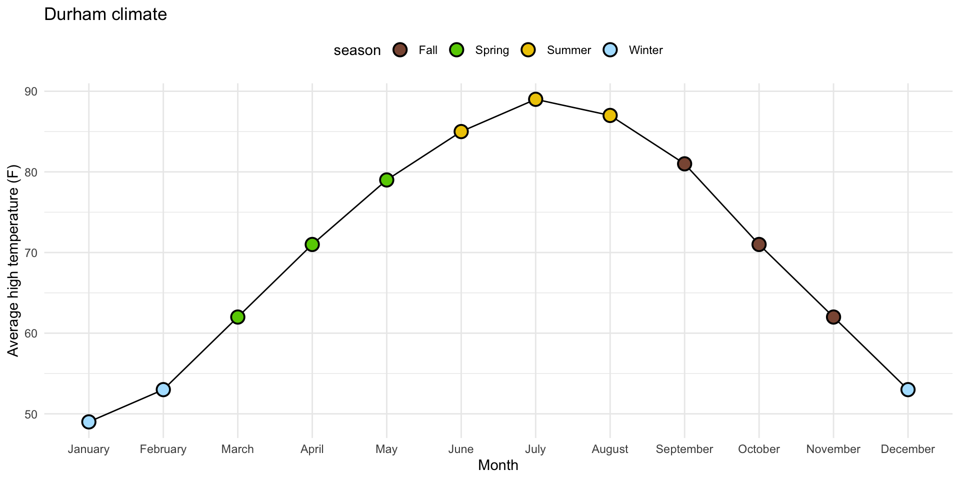
4. Order legend chronologically
durham_climate |>
  mutate(
    month = fct_relevel(month, month.name),
    season = case_when(
      month %in% c("December", "January", "February") ~ "Winter",
      month %in% c("March", "April", "May") ~ "Spring",
      month %in% c("June", "July", "August") ~ "Summer",
      month %in% c("September", "October", "November") ~ "Fall",
    ),
    season = fct_relevel(season, "Winter", "Spring", "Summer", "Fall")
  ) |>
  ggplot(
    aes(x = month, y = avg_high_f, group = 1)
    ) +
  geom_line() +
  geom_point(
    aes(fill = season),
    shape = "circle filled", size = 4,
    color = "black", stroke = 1
  ) +
  scale_fill_manual(
    values = c(
      "Winter" = "lightskyblue1",
      "Spring" = "chartreuse3",
      "Summer" = "gold2",
      "Fall" = "lightsalmon4"
    )
  ) +
  labs(
    x = "Month",
    y = "Average high temperature (F)",
    title = "Durham climate"
  ) +
  theme_minimal() +
  theme(legend.position = "top")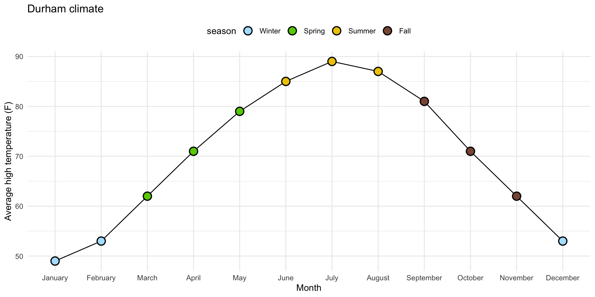
Task 2: pivot to replicate this…
Give it a shot in your ae-07-durham-climate-factors file. And don’t worry about prettification. Just get the two lines correct.
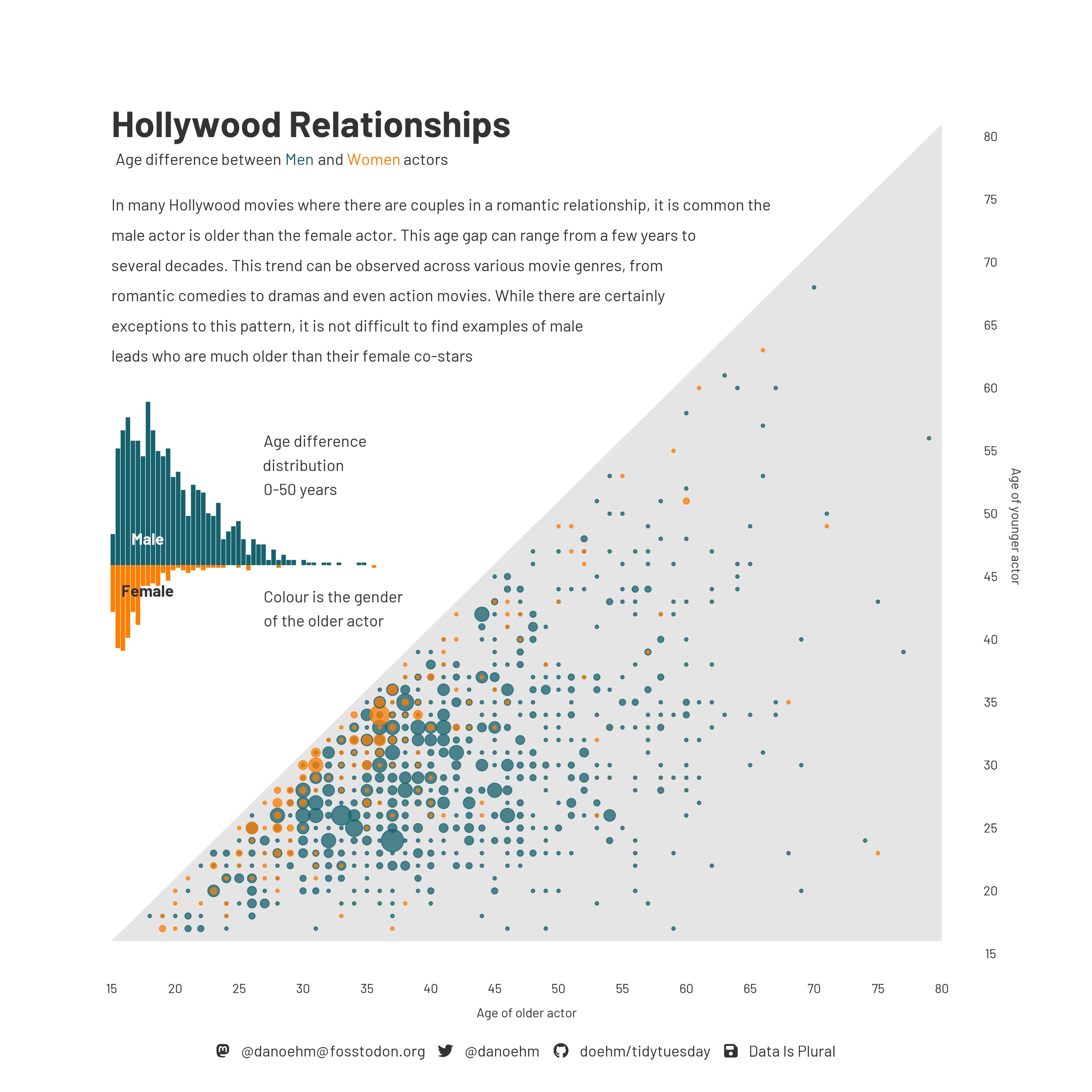
Age gap in Hollywood relationships
What is the story in this visualization?
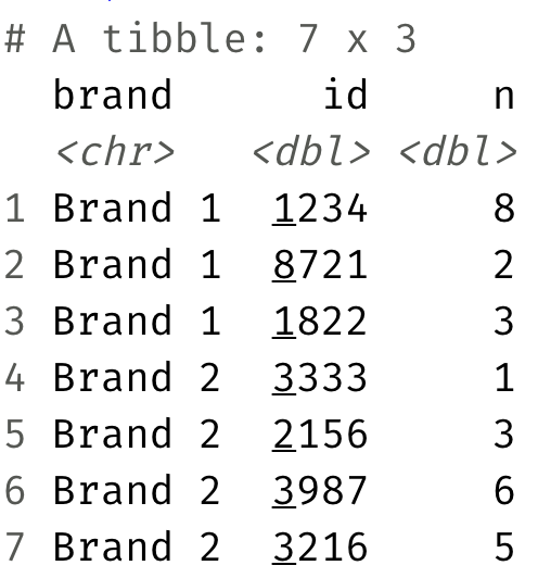
Sales data

Are these data tidy? Why or why not?
Sales data
What “data moves” do we need to go from the original, non-tidy data to this, tidy one?