Lab 2
Revisiting the Midwest
Introduction
In this lab, you’ll continue to hone your data science workflow and integrate what you learned so far in the course (data visualization) with what’s coming up (data wrangling).
Learning objectives
By the end of the lab, you will…
- Be able to create transform data using
dplyr - Build on your mastery of data visualizations using
ggplot2 - Get more experience with data science workflow using R, RStudio, Git, and GitHub
- Further your reproducible authoring skills with Quarto
- Improve your familiarity with version control using Git and GitHub
Getting started
Step 1: Log in to RStudio
- Go to https://cmgr.oit.duke.edu/containers and log in with your Duke NetID and Password.
- Click
STA198-199under My reservations to log into your container. You should now see the RStudio environment.
Step 2: Clone the repo & start a new RStudio project
Go to the course organization at github.com/sta199-s25 organization on GitHub. Click on the repo with the prefix lab-2. It contains the starter documents you need to complete the lab.
Click on the green CODE button and select Use SSH (this might already be selected by default; if it is, you’ll see the text Clone with SSH). Click on the clipboard icon to copy the repo URL.
In RStudio, go to File ➛ New Project ➛Version Control ➛ Git.
Copy and paste the URL of your assignment repo into the dialog box Repository URL. Again, please make sure to have SSH highlighted under Clone when you copy the address.
Click Create Project, and the files from your GitHub repo will be displayed in the Files pane in RStudio.
Click lab-2.qmd to open the template Quarto file. This is where you will write up your code and narrative for the lab.
Step 3: Update the YAML
In lab-2.qmd, update the author field to your name, render your document, and examine the changes. Then, in the Git pane, click on Diff to view your changes, add a commit message (e.g., “Added author name”), and click Commit. Then, push the changes to your GitHub repository and, in your browser, confirm that these changes have indeed propagated to your repository.
If you encounter any issues with the above steps, flag a TA for help before proceeding.
Packages
In this lab, we will work with the tidyverse package, a collection of packages for performing data analysis in a “tidy” way.
-
Run the code cell by clicking on the green triangle (play) button for the code cell labeled
load-packages. This loads the package so that its features (the functions and datasets in it) are accessible from your Console. - Then, render the document that loads this package to make its features (the functions and datasets in it) available for other code cells in your Quarto document.
Guidelines
As we’ve discussed in the lecture, your plots should include an informative title, axes and legends should have human-readable labels and aesthetic choices should be carefully considered.
Additionally, code should follow the tidyverse style. Particularly,
there should be spaces before and line breaks after each
+when building aggplot,there should also be spaces before and line breaks after each
|>in a data transformation pipeline,code should be properly indented,
there should be spaces around
=signs and spaces after commas.
Furthermore, all code should be visible in the PDF output, i.e., should not run off the page on the PDF. Long lines that run off the page should be split across multiple lines with line breaks.1
As you complete the lab and other assignments in this course, remember to develop a sound workflow for reproducible data analysis. This assignment will periodically remind you to render, commit, and push your changes to GitHub.
You should have at least 3 commits with meaningful commit messages by the end of the assignment.
Back to the Midwest!
You will revisit and build on some of your findings from Lab 1, where you explored the midwest data frame. Remember that this data frame is bundled with the ggplot2 package and is automatically loaded when you load the tidyverse package. As a refresher, the data contains demographic characteristics of counties in the Midwest region of the United States. You can read the documentation for the data set, including variable definitions, by typing ?midwest in the Console or searching for midwest in the Help pane.
Question 1
Do some states have counties that tend to be geographically larger than others?
To explore this question, create side-by-side boxplots of area (area) of a county based on state (state). How do typical county area sizes compare across states? How do variabilities of county sizes compare across states? Which state has the single largest county? Identify the name of this county. You can use the data viewer to identify it interactively, you do not have to write code.
Now is another good time to render, commit, and push your changes to GitHub with a meaningful commit message.
Once again, make sure to commit and push all changed files so that your Git pane is empty afterwards.
Question 2
Do some states have a higher percentage of their counties located in a metropolitan area?
Create a segmented bar chart with one bar per state and the bar filled with colors according to the value of metro – one color indicating Yes and the other color indicating No for whether a county is considered to be a metro area. The y-axis of the segmented barplot should range from 0 to 1, indicating proportions. Compare the percentage of counties in metro areas across the states based on this plot. Make sure to supplement your narrative with rough estimates of these percentages.
For this question, you should begin with the data wrangling pipeline below. We will learn more about data wrangling in the coming weeks, so this is a mini-preview. This pipeline creates a new variable called metro based on the value of the existing variable called inmetro. If the value of inmetro is equal to 1 (inmetro == 1), it sets the value of metro to "Yes", and if not, it sets the value of metro to "No". The resulting data frame is assigned back to midwest, overwriting the existing midwest data frame with a version that includes the new metro variable.
Now is another good time to render, commit, and push your changes to GitHub with a meaningful commit message.
And once again, make sure to commit and push all changed files so that your Git pane is empty afterward. We keep repeating this because it’s important and because we see students forget to do this. So take a moment to make sure you’re following along with the version control instructions.
Question 3
Calculate the number of counties in each state and display your results in descending order of number of counties. Which state has the highest number of counties, and how many? Which state has the lowest number, and how many?
The number of counties in a state can change over time, so the values you see in this output may not be true today.
Render, commit, and push your changes to GitHub with the commit message “Added answer for Question 3”.
Make sure to commit and push all changed files so that your Git pane is empty afterward.
Question 4
While two counties in a given state can’t have the same name, some county names might be shared across states. A classmate says “Look at that, there is a county called ___ in each state in this dataset!” In a single pipeline, discover all counties that could fill in the blanks. Your response should be a data frame with only the county names that could fill in the blank and the number of times they appear in the data.
You will want to use the filter() function in your answer, which requires a logical condition to describe what you want to filter for. For example, filter(x > 2) means filter for values of x greater than 2, and filter(y <= 3) means filter for values of y less than or equal to 3.
The table below is a summary of logical operators and how to articulate them in R.
| operator | definition |
|---|---|
< |
less than |
<= |
less than or equal to |
> |
greater than |
>= |
greater than or equal to |
== |
exactly equal to |
!= |
not equal to |
x & y |
x AND y
|
x | y
|
x OR y
|
is.na(x) |
test if x is NA
|
!is.na(x) |
test if x is not NA
|
x %in% y |
test if x is in y
|
!(x %in% y) |
test if x is not in y
|
!x |
not x
|
Render, commit, and push your changes to GitHub with the commit message “Added answer for Question 4”.
Make sure to commit and push all changed files so that your Git pane is empty afterward.
Question 5
Return to the following box plot of population densities where you were asked to identify at least one outlier.
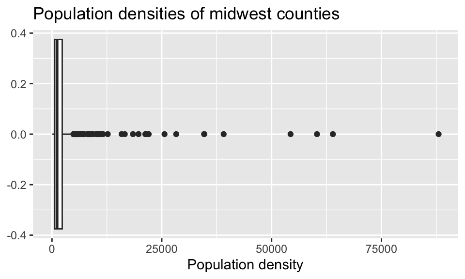
In this question, we want you to revisit this box plot and identify the counties described in each section.
a. The counties with a population density higher than 25,000. Your code must use the filter() function.
b. The county with the highest population density. Your code must use the max() function.
Answer using a single data wrangling pipeline for each part. Your response should be a data frame with five columns: county name, state name, population density, total population, and area, in this order. If your response has multiple rows, the data frame should be arranged in descending order of population density.
Render, commit, and push your changes to GitHub with the commit message “Added answer for Question 5”.
Make sure to commit and push all changed files so that your Git pane is empty afterward.
Question 6
In Lab 1 you were also asked to describe the distribution of population densities. The following is one acceptable description that touches on the shape, center, and spread of this distribution. Calculate the values that should go into the blanks.
The distribution of population density of counties is unimodal and extremely right-skewed. A typical Midwestern county has population density of ____ people per unit area. The middle 50% of the counties have population densities between ___ to ___ people per unit area.
Think about which measures of center and spread are appropriate for skewed distributions.
Render, commit, and push your changes to GitHub with the commit message “Added answer for Question 6”.
Make sure to commit and push all changed files so that your Git pane is empty afterward.
Question 7
This is the plot we ask for in Question 2:
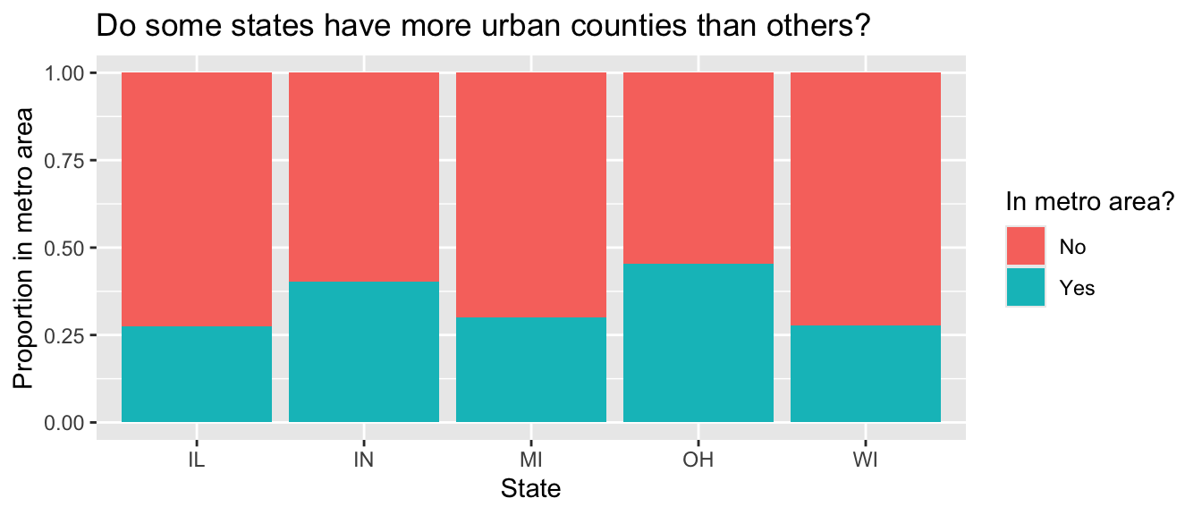
Use a single data pipeline to calculate the proportions that underlie this plot.
Render, commit, and push your changes to GitHub with the commit message “Added answer for Question 7”.
Make sure to commit and push all changed files so that your Git pane is empty afterward.
Question 8
Return to the following scatter plot of percentage below poverty vs. percentage of people with a college degree, where the color and shape of points are determined by state where you were asked to identify at least one county that is a clear outlier by name.
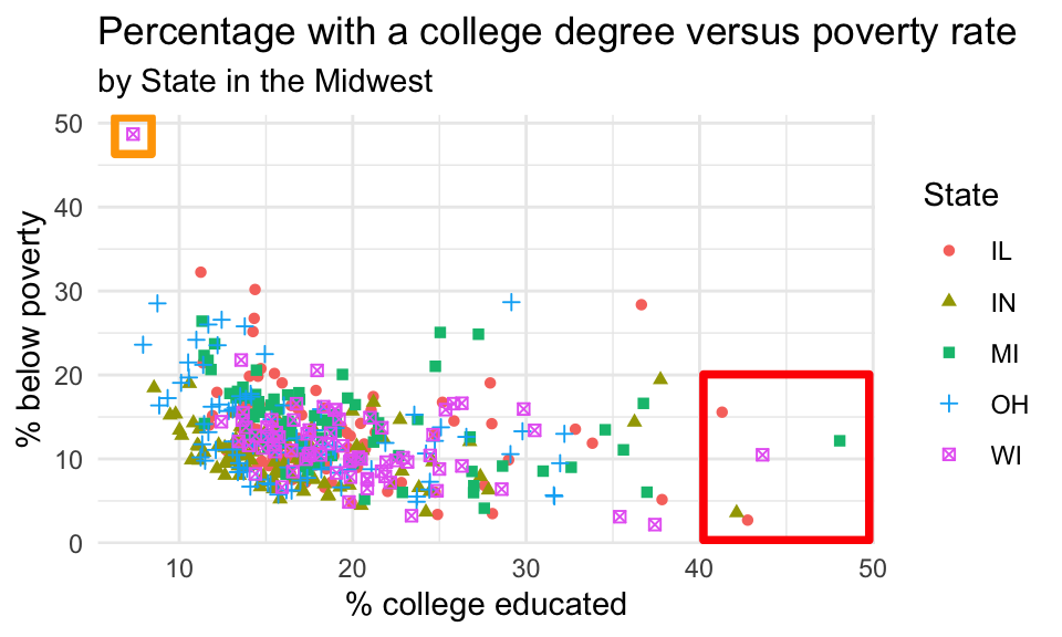
a. In a single pipeline, identify the observations marked in the orange square in the upper left corner. Your answer should be a data frame with four variables: county, state, percentage below poverty, and percentage college educated.
b. In a single pipeline, identify the observations marked in the red square in the plot above. Your answer should again be a data frame with four variables: county, state, percentage below poverty, and percentage college educated.
c. Bring your answers from part (a) and part (b) together! In a single pipeline, and a single filter() statement, identify the observations marked in the red and orange square in the plot above. Your answer should again be a data frame with four variables: county, state, percentage below poverty, and percentage college educated.
d. Create a new variable in midwest called potential_outlier. This variable should take on the value:
Yesif the point is one the ones you identified in part (c), i.e., one of the points marked in the squares in the plot above.Nootherwise.
Then, display the updated midwest data frame, with county, state, percentage below poverty, percentage college educated, potential_outlier as the selected variables, arranged in descending order of potential_outlier.
e. Recreate the visualization above, i.e., a scatterplot of the percentage below poverty vs. the percentage of people with a college degree. However, color the points by the newly created potential_outlier variable instead of the state.
Render, commit, and push your changes to GitHub with the commit message “Added answer for Question 8”.
Make sure to commit and push all changed files so that your Git pane is empty afterward.
Question 9
a. In a single pipeline, calculate the total population for each state and save the resulting data frame as state_population. Then, display the data frame, state_population, in descending order of total population.
b. Then, in a separate pipeline, calculate the proportion of the total population in each state. Once again, display the results in descending order of proportion of population.
In answering parts (a) and (b), you’ll create two new variables, one for the total population and the other for the proportion of total proportion. Make sure to give them “reasonable” names – short but evocative.
c. Which Midwestern state is most populous, and what percent of the Midwest population lives there? Which is the least populous and what percent lives there?
Render, commit, and push your changes to GitHub with the commit message “Added answer for Question 9”.
Make sure to commit and push all changed files so that your Git pane is empty afterward.
Question 10
Calculate the average percentage below poverty for each state and save the resulting data frame as state_poverty with the columns state and mean_percbelowpoverty.
Then, in a new pipeline, display the state_poverty data frame in ascending order of mean_percbelowpoverty. Which state has the lowest average percentage below poverty across its counties? Which state has the highest average percentage below poverty across its counties?
Render, commit, and push your changes to GitHub with the commit message “Added answer for Question 10”.
Make sure to commit and push all changed files so that your Git pane is empty afterward.
Wrap-up
Submission
Once you are finished with the lab, you will submit your final PDF document to Gradescope.
Before you wrap up the assignment, make sure all of your documents are updated on your GitHub repo. We will be checking these to make sure you have been practicing how to commit and push changes.
To be considered ” on time, ” you must turn in a PDF file to the Gradescope page by the submission deadline.
To submit your assignment:
- Go to http://www.gradescope.com and click Log in in the top right corner.
- Click School Credentials \(\rightarrow\) Duke NetID and log in using your NetID credentials.
- Click on your STA 199 course.
- Click on the assignment, and you’ll be prompted to submit it.
- Mark all the pages associated with each question. All the pages of your lab should be associated with at least one question (i.e., should be “checked”).
Make sure you have:
- attempted all questions
- rendered your Quarto document
- committed and pushed everything to your GitHub repository such that the Git pane in RStudio is empty
- uploaded your PDF to Gradescope
- selected pages associated with each question on Gradescope
Grading and feedback
Some of the questions will be graded for accuracy.
Some will be graded for completion.
-
There are also workflow points:
- for coding style;
- for committing at least three times as you work through your lab;
- for pushing your final rendered PDF into your lab repo before the deadline (in addition to uploading it to Gradescope);
- for overall organization.
You’ll receive feedback on your lab on Gradescope within a week.
Footnotes
Remember, haikus, not novellas, when writing code!↩︎